

In August, the U.S. Treasury published its regular report on financial flows between the country and the rest of the world. As with any statistical report, it looked boring enough and practically half-full of numbers. However, under closer inspection, it enables us to see an important tendency that cannot help but raise questions about the prospects of the American national debt.
The market of the financial responsibilities of the U.S. Treasury is the most voluminous market of debt in the world, and over the course of the last decades, it virtually filled the role of a “safe harbor” for international investors like central banks, foundations, big commercial banks and many others. On the other hand, the big, traded part of the American national debt, which in the last few years has been actively used to stimulate the U.S. economy, has teetered on the edge of recession after the 2007 to 2008 crisis.
In the not-so-distant past, from 2001 to 2006, it was also a key source in financing fast-growing military expenses, which the Bush administration neglected following the events of Sept. 11.
Since that market plays such a key role in the entire country, as it does in the world in general, any tendency that cultivates doubt of its stability deserves undivided attention. While in 2012 the whole world financed the U.S. through bond operations to the tune of $376 billion, in 2013 a sum of nearly $367 billion was withdrawn from the country and 2014 solidified, if not strengthened, that tendency.
Considering the dynamic nature of the world market, it could be just seasonal vacillation, but when we glance at Graph #1, the sense of accumulating problems does not dissipate.
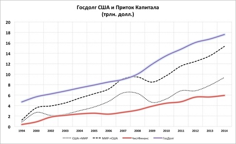
Graph #1: (SEE HERE)
Beginning with the culmination of the 1990s, the American national debt grew at a significant rate, and after the crisis of 2007 to 2008, that process got even faster. Now, the value has nearly reached $18 trillion, which is more than the U.S. gross domestic product. Until recently, American stocks and bonds were being bought at the same rate by the rest of the world.
However, focusing attention on the opposite process — American companies buying bonds from all over the world — it becomes apparent that the speed of money coming into the U.S. consistently fell. In the last two to three years, it sharply slowed, and according to the last Treasury report, went negative.
That is, instead of an influx to American stocks, we see a growing outflow. Nevertheless, the overall cumulative amount of worldwide financing to the U.S. is still about $6 trillion. The hypothesis could arise that the American stock market is so attractive that the rest of the world aspires to acquire American stocks and bonds. However, that is simply not the case.
Graph #2: (SEE HERE)
As it is easy to see in Graph #2, on the corporate level the U.S. is investing around the world, but the opposite is not true. This situation has been progressing this way for at least the past three years. What we see in this graph does not include information about operations in the U.S. banking sector. It only contains information about the operations of companies, foundations and individuals.
Then, is it possible that the American banking system is collecting money from all around the world and pouring it into the American economy? In part, yes.
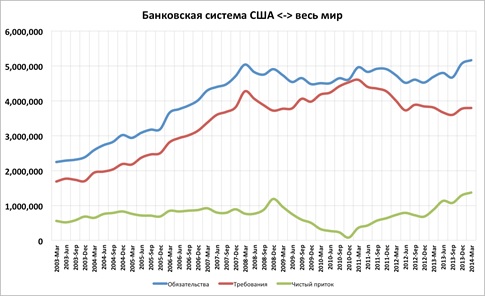
Graph #3: (SEE HERE)
As is visible in Graph #3, at the level of the banking systems, American banks and financial companies have consistently gathered more money from the rest of the world than they’ve distributed over at least the last 10 years. However, the range of net income of the banking system from the entire world is about equal to the range of investment by American companies in the rest of the world.
And so, as it turns out, the amount of capital that the U.S. private sector moves is about equal to that of the private sector of the rest of the world.
Then what is the meaning of the accumulated inflow of $6 trillion?
Having combined all three graphs, it could be concluded that over the course of the last 15 to 20 years, money that has come into the U.S. from around the world from individual investors, government foundations and central banks alike has mostly gone to financing the ever-growing U.S. national debt.
However, as the past few reports of the U.S. Treasury have shown, that process has stopped or even started reversing itself.
We can only guess what a U-turn will actually mean for the national debt of the United States. But remember, the second — if not the first — most active buyer of Treasury bonds is the U.S. Federal Reserve. If the debt continues growing at this rate but the world stops buying it, then the pressure on the American central bank will only get worse.
In recent times, from session to session, the Fed has been discussing possibly beginning a process to increase the interest rate. Together with the closing of the Asset Purchase Program, this would mean the growth of the interest rate — not only in the short term, but in the long term as well. For the U.S. national debt, this means growth in the value of services, and in the end, the growth of the expense of the debt itself, which has already passed a safe limit, being approximated at 80 percent of the gross domestic product.
However, the Fed’s plans to increase the interest rate and decrease its printing activity could run into a very serious problem: growing unwillingness from the rest of the world to finance the American budget, and a quickly growing national debt.
The situation looks like a “zugzwang” in chess, when any move that is available to a player will lead to a disadvantageous position.
In the end, the policy of “cheap money” from the Fed, the sharp rise in the national debt, the central bank buying up that debt in very large quantities and also the growing political risks for holders of American bonds all fail to prepossess optimism, and the world is apparently trying to fluidly move its capital to a safer place. It only has to come to an agreement about where that place will be.
*Editor’s note: The colors used in the graphs can be understood as follows: In Graphs 1 and 2, a blue line represents U.S. national debt; a dashed line represents world > U.S.; a dotted line represents U.S. > world; a red line represents clean financial gains. In Graphs 3 and 4, a blue line represents world > U.S.; a red line represents U.S. > world; a green line represents outflow.
Leave a Reply
You must be logged in to post a comment.